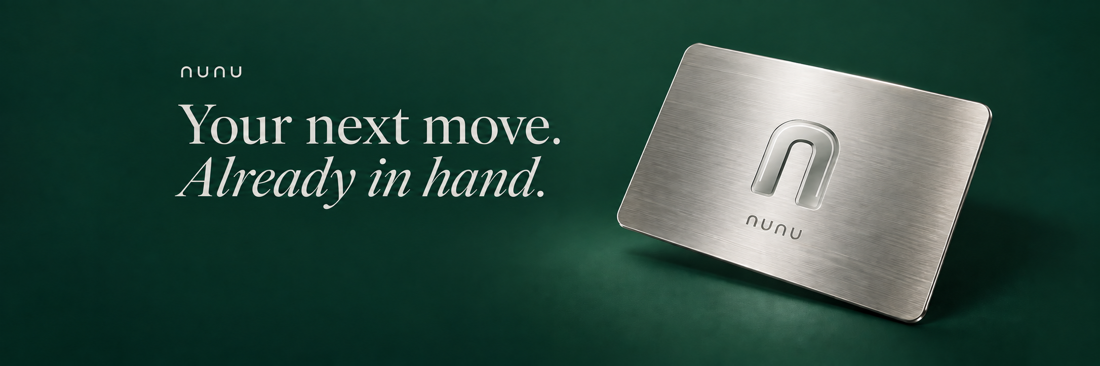
A card is a small object with a daily job
You reach for it in the middle of a conversation, on the way to somewhere else, or while checking out after a long day. A payment card occupies very little space in your life. The experience around it can take up considerably more.
Nunu starts with that everyday relationship: the object you carry, the information you check and the controls you expect to find. Our aim is to bring those pieces into a coherent experience, with a visual identity that feels as considered as the product we want to build.
An identity you can recognise at a glance
The Nunu identity centres on a rounded, silver n. Its open arch gives the mark a clear silhouette at the scale of a profile picture, a navigation bar or a card face.
Deep forest green gives the identity its foundation. Pearl tones and silver bring contrast. Together, they set the direction for a product that should feel composed in the hand and clear on a screen.
The card studies explore silver, graphite and forest-green finishes. They are material and colour explorations, rather than an announcement of physical cards available to order. Their purpose is to make the design direction tangible before final materials and fulfilment are confirmed.
 nunu
nunuThe experience matters beyond the first impression
A useful account experience has to make sense after the first visit. Where is the activity? How do you reach your cards? How do you return to the website without losing your session?
Those are practical design questions, and they shape Nunu just as much as the card does. The public website introduces the concept. The signed-in account is a separate part of the experience, reached through Whop sign-in. You can move back to the Nunu website from the account area and return to your account while remaining signed in.
The website also contains an illustrative spending interface. Its example transactions, categories and balances show the intended presentation of information. They are sample data, not customer activity or evidence of money moving through the product.
Try the interaction. Understand what it does.
The card demonstration lets you freeze and unfreeze the example card, reveal or hide example details, and adjust an illustrative spending limit. Each action changes the demonstration visibly, so you can explore the interaction for yourself.
The finish selector works in the same spirit: choose a colour and see the card visual change. It is a way to experience the design, not a card order.
These boundaries belong alongside the controls. A visitor should be able to tell whether an action is an example, a preference or a change to a real account without having to guess.
What is available today
Nunu has a public website and a connected Whop sign-in flow for account access. The features available inside an account depend on its verification status, region and provider eligibility.
The physical card visuals remain concepts. Physical card ordering and final materials are not confirmed, and Apple Pay is not connected in this version. The website does not make a credit offer. No APR, cashback rate or insurance benefit is being announced here.
That distinction is part of presenting the product accurately: the design can show where Nunu is heading, while the account experience shows what is available to an eligible user today.
A considered beginning
Nunu brings a recognisable identity, an interactive card concept and connected account access into one place. The next measure of its quality is how clearly those parts work together in everyday use.
Explore the card, try the demonstration and read the product details. If you sign in, check the options available to your account before deciding what to use.
Your next move. Already in hand.